4 Keyword Match Types in Google Ads [2026 Edition]

There’s no shortage of information about landing page best practices out there – but not all are worth your time. If you’re new to marketing, let’s clear what a landing page is. To make your visitors say “Wow, I need this!” – a moment to convert visitors into loyal customers.
This happens only if your visitors stay on your landing page for a longer period. Over 48% of visitors leave a landing page without exploring in-depth information. Moreover, the bounce rate ranges between 60 – 70%.
So, what steps do we need to take to keep those visitors?
Well, here we’ve compiled a few proven tips for you. In this blog, we’ll walk you through the 8 proven landing page best practices for 2025 that will help you get more conversions.

A high-converting landing page must appeal to your target audience, compel them to act, and meet their expectations.
Here, you have the 8 landing page best practices – most of them are small, but a simple tweak can bring a surprising impact to your conversion rate.
You might think creating ad copy is difficult, but developing a landing page is even harder. When creating your landing page, first ensure your goal – what action do you want visitors to take after clicking the ad?
Make sure that the tone of the landing page aligns with the tone used in your ad. Moreover, if your ad says, “Learn how here or Get freebie,” your landing page should instantly explain exactly how to get the freebie. This builds trust, keeps visitors engaged, and guides them toward your call-to-action (CTA).
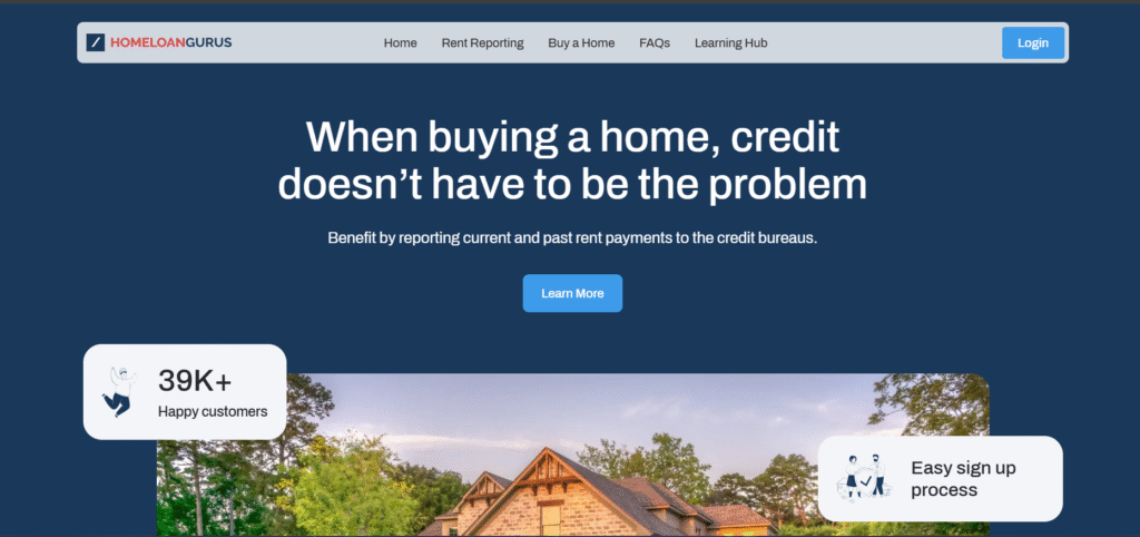
Image Credits: Homeloangurus
No matter how great your product or service is, if your headline doesn’t grab attention in the first few seconds, most visitors won’t stick around long enough to discover it. Studies show that for every 10 people who land on a page, at least seven will leave right away. The reason – your headline doesn’t set the tone for your landing page.
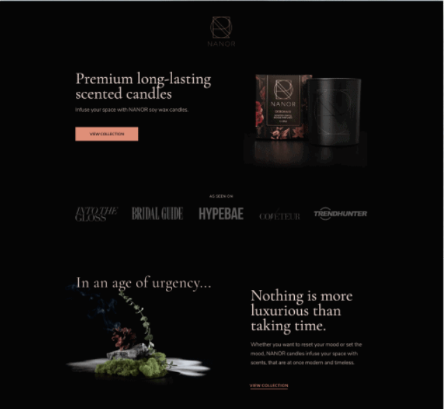
Image credits: Nanor
So, what makes a headline truly effective? A good headline communicates value immediately. Visitors should instantly understand what they stand to gain by staying on your page.
For instance, if you’re working for a fitness company and want to sell your fitness plan – don’t go for a title like “Get a Free Fitness Plan Today”. Try out specific and benefit-oriented like “Get a Free 7-Day Fitness Plan to Lose 3 Pounds This Week”
The second headline clearly tells the visitor what they’ll achieve and when. More importantly, don’t stop at the headline. Use a subheading to reinforce your message. For instance, if your headline highlights the main benefit, your subheadline can briefly explain how you deliver it.
A landing page without visuals feels incomplete. They help visitors feel the benefit of your offer before they even read the details. The image communicates emotion and creates a mental picture of the transformation your product or service provides.
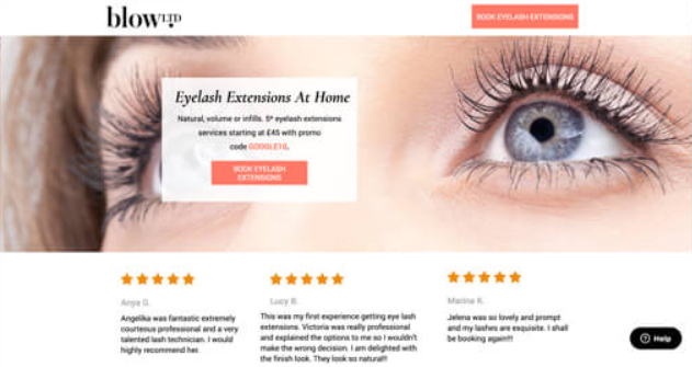
Image credits: Blow LTD
When selecting images for your page, keep these landing page best practices in mind:
One of the landing page best practices is – art of visual contrast. Use contrast colors to guide your visitors’ eyes straight to the important part of your landing page.
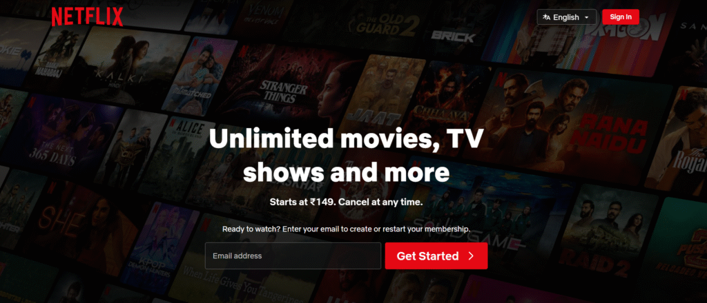
Image credits: Netflix
In this example from Netflix, you can’t ignore the CTA button. The “Get Started” button draws visitors’ attention. The textured black background makes both the headline and the CTA pop, while generous negative space(white space) keeps the design clean and focused.
So, test out different color combinations for your CTA using A/B testing. You might be surprised how a small color change can significantly improve conversion rates.
When it comes to landing page best practices, forms can make your conversions. So, keep them simple enough to encourage sign-ups, but smart enough to filter out spam and low-quality leads.
Ask only for the essentials at first, then gather more info later using tools like smart forms. More importantly, add spam protection (like reCAPTCHA) to keep bots out without frustrating real users.
Create a form length for your offer. For instance, a free guide might only need a name and email, while a demo request might need some extra fields.
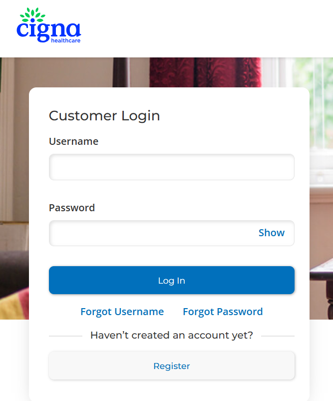
Image credits: Cigna
And above all, test your forms regularly. Sometimes, removing a single unnecessary field can boost conversion while keeping your leads relevant.
Through the “above the fold”, you can include eye-catching stories were people couldn’t miss. One of the simplest landing page best practices is placing your key elements above the fold – the first screen visitors see without scrolling.
Why? Because first impressions happen fast. But I wonder, is my offer easily understandable within 5 seconds?
Yes, only key elements matter here. If your headline, main offer, benefits, and CTA should be instantly visible above the fold, without this – you can lose your visitors before they even see what you’re offering.
Your landing page has one clear goal – whether that’s getting visitors to fill out a form, download an eBook, sign up for a free trial, or make a purchase. Every element on the page – visuals, copy, layout should work together to drive visitors toward that single CTA.
The more CTAs you add, the more you risk confusing visitors. So, keep it simple – one page, one purpose. Place your CTA exactly where visitors expect to find it when they land – usually above the fold and repeat it strategically further down the page. Your CTA button should be bold, benefit-driven, or action-oriented (Get My Free Guide instead of Submit).
Once a visitor completes your desired action – whether it’s filling out a form, signing up for a webinar, or making a purchase – you shouldn’t just stop there. You need to acknowledge them, reassure them, and guide them to their next step.
Instead of a plain “Thank you. Your information has been submitted,” give them a visual confirmation. This builds trust and prevents any uncertainty. A dedicated thank you page is even better, as it gives you space to reassure them.
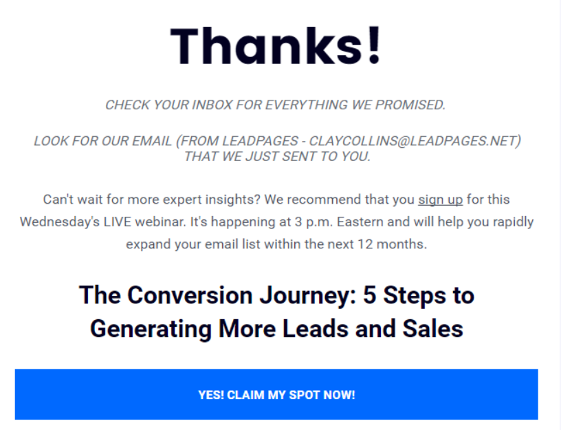
Image Credits: Leadpages
Done right, it makes your visitors feel valued and moves them into your marketing funnel.
By following these landing page best practices and making tweaks based on real customer data – you can improve your conversion rate. Every headline, every image, every CTA should work together to guide visitors exactly where you want them to go.
And, if you want landing pages that don’t just look great but actually bring real results, contact NB Marketing Solutions to enhance your conversion rate.